Test Automation Analytics: Metrics, Dashboards, and Tools
Most QA teams collect test data but can’t extract insights from it. Test automation analytics closes that gap.
Your test suite runs 3,000 tests every night. Every morning, you get the same summary: 2,847 passed, 153 failed. And every morning, the same question: so what?
That number tells you something happened. It does not tell you what is getting worse, what has been broken for 2 weeks, or which failures are real bugs versus flaky noise. The gap between raw test output and real engineering decisions is exactly where test automation analytics lives.
I have spent the last 4 years building and running Playwright test suites at scale, first at a fintech startup with 1,200 tests and then at an enterprise with 8,000+. In that time I have learned that teams do not fail because they lack tests. They fail because they lack visibility into what their tests are actually telling them. Test analytics bridges that gap.
This guide breaks down the 10 metrics I track on every project, with formulas you can plug in today, benchmarks from real teams, Playwright code you can run, and a tool comparison that skips the marketing fluff. Whether you are a QA lead trying to justify tooling to your VP, an SDET scaling from 500 to 5,000 tests, or an engineering manager who needs a single "can we ship?" number, this is the reference I wish I had 3 years ago.
What are test automation analytics and why do they matter?
Test automation analytics is the practice of collecting, aggregating, and interpreting data from automated test executions to make decisions about software quality, release readiness, and engineering efficiency.
It sits one layer above test automation reporting. Reporting shows you what happened in a single run. Analytics shows you what is happening across runs, across time, across your entire test suite.
Here is the practical difference:
| Capability | Reporting | Analytics |
|---|---|---|
| How many tests failed today? | ||
| Are failures increasing week over week? | ||
| Which failures share the same root cause? | ||
| Is this flaky test getting worse or stabilizing? | ||
| Can we release with confidence right now? | ||
| Which module introduced the most regressions this sprint? |
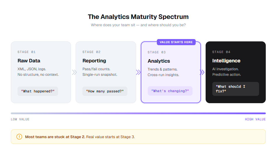
Think of it as a maturity spectrum. Most teams start at raw data, graduate to reporting, and then hit a wall. Analytics breaks through that wall. Intelligence (where AI surfaces patterns you did not look for) is the layer above that.
Expert insight: According to the World Quality Report 2024-25 (rel="nofollow"), 61% of organizations report that their test data is underutilized for decision-making. The bottleneck is not data collection. It is the analytics layer between raw results and action.
The teams getting real value from their suites are not running more tests. They are running the same tests and understanding the results better. That is what data-driven QA actually means in practice.
10 test automation analytics metrics every QA team should track
Listing metrics is easy. Knowing what each one actually tells you, how to calculate it, and what "good" looks like? That is the hard part. Here are the 10 I track on every project, with formulas, worked examples, and benchmarks from teams running 1,000 to 10,000+ Playwright tests.
1. Pass rate
The most basic metric, and the most commonly misread.
- Formula: (Passed tests / Total tests executed) x 100
- Example: 2,847 passed out of 3,000 total = 94.9% pass rate
- Benchmark: 95%+ on main branch. Below 90% signals systemic issues. Below 85% means your suite is generating more noise than signal.
What it actually tells you: Not much on its own. A 95% pass rate sounds healthy until you realize the same 150 tests have been failing for 3 months and nobody has investigated them. Pass rate only becomes useful when you track it over time and break it down by module, test tag, or environment.
At one company, our pass rate was a consistent 93%. We assumed that was normal. When we finally broke it down by feature area, we discovered the checkout module was at 71% while everything else was at 98%. That one module was dragging the whole number down, and we had been ignoring it for 6 months.
Common mistake: Treating pass rate as a snapshot. A pass rate of 94% on Monday and 94% on Friday means nothing. A pass rate that dropped from 98% to 94% over 2 weeks tells you something is getting worse. Always track the trend, not the number.
2. Flaky test rate
The silent killer of test suite trust.
- Formula: (Tests with inconsistent pass/fail results across reruns on the same code / Total tests) x 100
- Example: 45 tests flip between pass and fail without any code changes out of 3,000 = 1.5% flaky rate
- Benchmark: Below 1% is healthy. Above 3% means your suite is actively misleading you. Above 5% means engineers have stopped trusting CI results entirely.
What it actually tells you: How much of your test suite you can actually trust. A flaky test that passes 80% of the time will still block your pipeline 1 in 5 runs. Teams that do not track flaky tests explicitly end up retrying entire pipelines, wasting CI minutes, and burying real failures in the noise.
I tracked this at a previous team and found that 67% of our CI retries were caused by just 12 flaky tests. Those 12 tests cost us approximately 140 CI hours per month in wasted reruns. Fixing them saved more time than writing 200 new tests would have.
Warning: Do not just count flaky tests. Track their trend. A team that had 12 flaky tests last month and has 45 this month has a process problem, not a test problem. Use flaky test detection tools to catch them before they multiply.
3. Test execution time
How long your feedback loop actually takes.
- Formula: Total wall-clock time from first test start to last test finish
- Example: Full suite runs in 47 minutes on 4 parallel workers
- Benchmark: Under 10 minutes for PR-level checks. Under 30 minutes for full suite. Under 60 minutes is acceptable for very large suites with sharding.
What it actually tells you: Whether your tests are fast enough to be useful. A suite that takes 90 minutes means developers context-switch to other tasks while waiting, which research from Microsoft shows costs 15-25 minutes of refocus time per switch. Track this per test too. Slow tests taking 30+ seconds individually are candidates for optimization or splitting.

Tip: The biggest execution time wins come from parallelization and worker optimization, not from making individual tests faster. A 200-test suite running serially in 40 minutes can often drop to 8 minutes with 5 properly configured workers.
4. Mean time to detect (MTTD)
How quickly your suite catches problems after they are introduced.
- Formula: Average(Time of detection - Time of code change that introduced the defect)
- Example: A bug introduced in Monday's 2pm commit gets caught by Tuesday's 9am nightly run = 19 hours MTTD
- Benchmark: Under 1 hour with continuous testing on every PR. Under 4 hours with hourly scheduled runs. Under 24 hours with nightly runs.
What it actually tells you: Whether you are catching bugs fast enough for fixes to be cheap. According to the NIST Systems Security Engineering guide (rel="nofollow"), a defect caught in testing costs 6x less to fix than one found in production. With CI/CD integrations running Playwright on every push, you can bring MTTD under 30 minutes.
5. Mean time to resolve (MTTR)
How quickly failures get fixed once detected.
- Formula: Average(Time of fix merged - Time failure first detected) for all failures that were subsequently fixed
- Example: Average time from test failure first flagged to fix merged = 4.2 hours
- Benchmark: Under 4 hours for critical path failures. Under 24 hours for non-blocking failures. Under 48 hours for cosmetic issues.
What it actually tells you: How responsive your team is to test signals. High MTTR usually means one of 3 things: failures are not assigned to anyone, failures are hard to investigate (because you are reading raw stack traces instead of structured analysis), or nobody trusts the failures enough to act on them.
We reduced MTTR from 18 hours to 3.5 hours by doing 2 things: (1) routing failure notifications to the engineer who last touched the affected file, and (2) using AI-powered root cause analysis to generate investigation briefs instead of making engineers read raw traces.
Expert insight: MTTR is the metric that best correlates with team velocity. The DORA research program consistently finds that elite engineering teams have MTTR under 1 hour, while low performers average over 1 week. Your test analytics dashboard should make MTTR impossible to ignore.
6. Test coverage percentage
What percentage of your application's testable surface is actually tested.
- Formula: (Lines or branches covered by tests / Total lines or branches) x 100
- Example: 14,200 lines covered out of 18,500 total = 76.8% coverage
- Benchmark: 80%+ for critical paths (checkout, auth, payments). 60%+ overall. 100% is a vanity target, so do not chase it.
What it actually tells you: Where your blind spots are. Coverage by itself is a weak metric because you can have 95% line coverage with zero useful assertions. But coverage gaps are always informative. If your checkout flow has 40% coverage and your settings page has 95%, you are testing the wrong things.
Playwright has built-in code coverage support that makes tracking this straightforward. Here is how to set it up:
import{defineConfig} from '@playwright/test';

export default defineConfig({
   use:{
       // Enable coverage collection
        contextOptions:{
       // Coverage is collected per-context
    },
},
// Use a custom reporter to aggregate coverage data
   reporter:[
      ['html'],
      ['json',{outputFile : 'test-results/results.json'}],
   ],
});Tip: Track coverage delta per PR, not just absolute coverage. A PR that drops coverage by 5% on a critical module is a bigger risk signal than the overall number. Set up GitHub status checks to block PRs that reduce coverage on critical paths.
7. Defect escape rate
How many bugs make it past your test suite into production.
- Formula: (Defects found in production / Total defects found across all stages) x 100
- Example: 8 production bugs out of 120 total bugs detected = 6.7% escape rate
- Benchmark: Under 5% for mature teams. Under 10% for teams still scaling automation. Above 15% means your test suite has serious gaps.
What it actually tells you: How effective your test suite actually is as a safety net. A low escape rate means your tests catch what matters. A high rate means you are either not testing the right scenarios or your assertions are too shallow. Cross-reference escapes with your test failure analysis to identify which failure categories are getting through.
According to Capers Jones' research on software defect origins (rel="nofollow"), approximately 35% of defects originate in requirements, 25% in design, and 40% in code. Your test suite primarily catches code-level defects. If your escape rate is high despite good code coverage, you may need to invest in requirement-level testing (BDD scenarios, acceptance criteria validation).
8. Failure clustering score
How concentrated your failures are across error patterns.
- Formula: 1 - (Unique error patterns / Total test failures) expressed as a percentage
- Example: 153 test failures cluster into 12 unique error patterns = 92.2% clustering (meaning 92% of failures are duplicates of just 12 root causes)
- Benchmark: If clustering is above 80%, you have a small number of root causes creating a large number of symptoms. That is actually good news because it means fixing 12 things removes 153 failures.
What it actually tells you: Whether your 153 failures are actually 153 problems or 12 problems appearing 153 times. This is the metric that error grouping was built for. Without it, you are triaging the same root cause over and over across different test names.
In Playwright, you can build a basic clustering mechanism using the error message and stack trace. Here is a simple approach:
import * as crypto from 'crypto';

export function getErrorFingerprint(error: {
  message: string;
  stack?: string;
}): string {
  // Normalize the error: strip line numbers, file paths, and dynamic values
  const normalized = error.message
    .replace(/\d+/g, 'N')           // Replace all numbers
    .replace(/\/[\w\-./]+/g, 'PATH') // Replace file paths
    .replace(/["'].*?["']/g, 'STR')  // Replace string literals
    .trim();

  // Take first line of stack trace for grouping
  const stackLine = error.stack?.split('\n')[1]?.trim() || '';
  const stackNormalized = stackLine
    .replace(/:\d+:\d+/g, ':N:N')
    .replace(/\/[\w\-./]+/g, 'PATH');

  const raw = `${normalized}|${stackNormalized}`;
  return crypto.createHash('md5').update(raw).digest('hex').substring(0, 12);
}

// Usage in a custom reporter:
// Group failures by fingerprint to see how many unique root causes exist
Expected output: When you run this against 153 failures, you might get back 12 unique fingerprints, each mapped to a list of test names. Instead of triaging 153 times, you triage 12 times.
Expert insight: Failure clustering is the most underrated metric in test analytics. It is also the metric that makes the strongest business case for analytics tooling. If you can show your VP that "we had 500 failures last week, but they were actually 8 problems," that reframes the entire conversation from "our tests are broken" to "we have 8 specific things to fix."
9. Release confidence score
A composite metric that answers "can we ship?"
- Formula:
Release Confidence = (
    pass_rate × 0.30
  + (1 - flaky_rate) × 0.20
  + critical_path_coverage × 0.25
  + (1 - escape_rate) × 0.15
  + mttr_health × 0.10
) × 100
Where mttr_health = 1.0 if MTTR < 4h, 0.75 if 4-8h, 0.5 if 8-24h, 0.25 if > 24h.
- Example: (0.95 × 0.30) + (0.985 × 0.20) + (0.88 × 0.25) + (0.93 × 0.15) + (0.75 × 0.10) = 0.9175 → 91.75 release confidence
- Benchmark: Above 90 = green light to ship. 75-90 = proceed with caution, review blockers. Below 75 = hold the release, investigate.
What it actually tells you: Whether your test suite supports a confident release decision right now. This is the single number that engineering managers care about. Build it as a composite of the other metrics, weighted by what matters to your team.
Here is how to compute it in your Playwright reporting pipeline:
interface MetricsSnapshot {
  totalTests: number;
  passedTests: number;
  flakyTests: number;
  criticalPathsCovered: number;
  criticalPathsTotal: number;
  prodBugsThisRelease: number;
  totalBugsThisRelease: number;
  avgMttrHours: number;
}

export function computeReleaseConfidence(m: MetricsSnapshot): {
  score: number;
  grade: 'GREEN' | 'YELLOW' | 'RED';
  breakdown: Record<string, number>;
} {
  const passRate = m.passedTests / m.totalTests;
  const flakyRate = m.flakyTests / m.totalTests;
  const coverage = m.criticalPathsCovered / m.criticalPathsTotal;
  const escapeRate = m.totalBugsThisRelease > 0
    ? m.prodBugsThisRelease / m.totalBugsThisRelease
    : 0;

  let mttrHealth = 0.25;
  if (m.avgMttrHours < 4) mttrHealth = 1.0;
  else if (m.avgMttrHours < 8) mttrHealth = 0.75;
  else if (m.avgMttrHours < 24) mttrHealth = 0.5;

  const score = (
    passRate * 0.30 +
    (1 - flakyRate) * 0.20 +
    coverage * 0.25 +
    (1 - escapeRate) * 0.15 +
    mttrHealth * 0.10
  ) * 100;

  const grade = score >= 90 ? 'GREEN' : score >= 75 ? 'YELLOW' : 'RED';

  return {
    score: Math.round(score * 10) / 10,
    grade,
    breakdown: {
      passRate: Math.round(passRate * 100 * 10) / 10,
      flakyRate: Math.round(flakyRate * 100 * 10) / 10,
      criticalCoverage: Math.round(coverage * 100 * 10) / 10,
      escapeRate: Math.round(escapeRate * 100 * 10) / 10,
      mttrHealth: Math.round(mttrHealth * 100),
    },
  };
}
Expected output:
{
  score: 91.8,
  grade: "GREEN",
  breakdown: {
    passRate: 95.0,
    flakyRate: 1.5,
    criticalCoverage: 88.0,
    escapeRate: 6.7,
    mttrHealth: 75
  }
}
10. Test stability score
How consistent your test results are over time.
- Formula: (Test runs with identical pass/fail results to previous run / Total consecutive run pairs) x 100
- Example: 28 out of 30 nightly runs produced the same pass/fail pattern = 93.3% stability
- Benchmark: Above 95% = highly stable suite. 90-95% = minor instability, investigate. Below 85% = your suite is noisy and needs serious attention.
What it actually tells you: Whether your test infrastructure is reliable enough to be the source of truth. A suite with 85% stability means 1 in 7 runs produces different results from the same code. At that point, engineers stop trusting the results, and your entire analytics pipeline becomes meaningless. Investigate infrastructure issues with your test execution history.
Common mistake: Confusing stability with pass rate. You can have a 60% pass rate with 99% stability (the same 40% of tests consistently fail). That is actually better than a 95% pass rate with 80% stability, because at least you know exactly what is broken. Instability is more dangerous than failure.
All 10 metrics at a glance
| Metric | Formula | Benchmark | What it tracks |
|---|---|---|---|
| Pass rate | (Passed / Total) x 100 | 95%+ | Build health |
| Flaky test rate | (Inconsistent / Total) x 100 | Below 1% | Suite trust |
| Execution time | Wall-clock start to finish | Under 10min (PR) | Feedback speed |
| MTTD | Avg(Detection - Introduction) | Under 1 hour | Catch speed |
| MTTR | Avg(Fix - Detection) | Under 4 hours | Response speed |
| Coverage % | (Covered / Total) x 100 | 80%+ critical | Blind spots |
| Defect escape rate | (Prod bugs / All bugs) x 100 | Under 5% | Suite effectiveness |
| Failure clustering | 1 - (Unique / Total) | 80%+ clustering | Root cause density |
| Release confidence | Weighted composite | Above 90 | Ship readiness |
| Stability score | (Identical runs / Total) x 100 | Above 95% | Infrastructure trust |
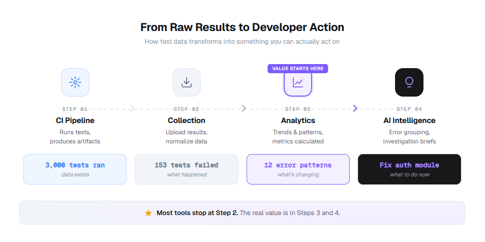
How test automation analytics turns raw results into action
Most teams are not short on test data. They are drowning in it. The problem is the pipeline between "3,000 tests ran" and "here is what you should fix first today."
Here is what that pipeline looks like when it actually works:
Stage 1: Collection
Your CI pipeline (GitHub Actions, GitLab CI, Azure DevOps) runs your Playwright tests and produces raw artifacts: XML reports, JSON results, trace files, screenshots. At this stage, you have data. Lots of it. Zero insight.
Stage 2: Aggregation
A reporting tool collects those results, normalizes them across runs, environments, and branches, and stores them in a single location. Now you can see all results in one dashboard instead of digging through CI logs. Most teams get stuck here.
Stage 3: Analytics
This is where the jump happens. Analytics layers calculate the 10 metrics above, track trends over time, detect patterns across failures, and flag anomalies. You go from "153 tests failed" to "153 tests failed, but 140 of them share 8 error patterns, and 3 of those patterns appeared for the first time this week."
Stage 4: Intelligence
AI takes the analytics output and generates investigation briefs, predicts which failures are flaky versus real regressions, and surfaces the 3 things you should fix first this morning. This is where tools like TestDino operate for Playwright teams. It does not just show you what happened. It tells you what it means and what to do about it.
Expert insight: The fastest teams I have worked with do not look at dashboards reactively. They have alerts on trend changes (not thresholds) that route to the right person. "Flaky rate increased 40% this week" goes to the infra lead. "New failure pattern in checkout module" goes to the engineer who last changed checkout. The goal is to eliminate the "checking the dashboard" habit entirely and replace it with actionable notifications.
The difference between Stage 2 and Stage 4 is the difference between a dashboard you glance at and a system you act on. Most reporting tools stop at Stage 2. The tools worth investing in get you to Stage 3 or 4.
How to build a test automation analytics dashboard that teams actually use
A dashboard is only as useful as the questions it answers. I have seen teams spend weeks building dashboards that look impressive in demos but never change anyone's behavior. The difference between a useful dashboard and a metrics graveyard comes down to what you put on it and how you structure it.
The 4 panels every analytics dashboard needs
Panel 1: Suite health summary
Pass rate trend (last 30 days), current flaky test count with trend arrow, test execution time with trend. This answers: "Is our suite getting healthier or sicker?"
Panel 2: Failure intelligence
Top failure patterns grouped by error signature, new failures (first seen in last 7 days), recurring failures (same error, 3+ consecutive runs). This answers: "What should I fix first?"
Panel 3: Coverage and gaps
Coverage by module or feature area, coverage delta from last release, untested critical paths flagged. This answers: "Where are our blind spots?"
Panel 4: Release readiness
Composite release confidence score, blocker count, PR-level test health for open PRs. This answers: "Can we ship today?"
Tip: Put the failure intelligence panel in the top-left corner. That is where eyes go first. Your dashboard should answer "what is broken and why" before "how is everything doing generally." I have watched 3 different teams reorganize their dashboards this way and each reported faster triage cycles within the first week.
Building a Playwright analytics reporter from scratch
If you want to build your own analytics pipeline, start with a custom Playwright reporter that extracts the data you need. Here is a production-grade starting point:
import type {
  FullConfig, FullResult, Reporter, Suite, TestCase, TestResult,
} from '@playwright/test/reporter';
import * as fs from 'fs';

interface TestMetric {
  name: string;
  file: string;
  status: 'passed' | 'failed' | 'timedOut' | 'skipped';
  duration: number;
  error?: string;
  errorFingerprint?: string;
  retries: number;
}

class AnalyticsReporter implements Reporter {
  private metrics: TestMetric[] = [];
  private startTime = 0;

  onBegin(config: FullConfig, suite: Suite) {
    this.startTime = Date.now();
    console.log(`\n Analytics Reporter: tracking ${suite.allTests().length} tests\n`);
  }

  onTestEnd(test: TestCase, result: TestResult) {
    const metric: TestMetric = {
      name: test.title,
      file: test.location.file,
      status: result.status,
      duration: result.duration,
      retries: result.retry,
    };

    if (result.error) {
      metric.error = result.error.message;
      metric.errorFingerprint = this.fingerprint(result.error.message);
    }

    this.metrics.push(metric);
  }

  onEnd(result: FullResult) {
    const totalTime = Date.now() - this.startTime;
    const passed = this.metrics.filter(m => m.status === 'passed').length;
    const failed = this.metrics.filter(m => m.status === 'failed').length;
    const flaky = this.metrics.filter(m => m.status === 'passed' && m.retries > 0).length;
    const total = this.metrics.length;

    // Error clustering
    const errorGroups = new Map<string, string[]>();
    this.metrics
      .filter(m => m.errorFingerprint)
      .forEach(m => {
        const group = errorGroups.get(m.errorFingerprint!) || [];
        group.push(m.name);
        errorGroups.set(m.errorFingerprint!, group);
      });

    const analytics = {
      timestamp: new Date().toISOString(),
      summary: {
        total,
        passed,
        failed,
        flaky,
        skipped: this.metrics.filter(m => m.status === 'skipped').length,
        passRate: ((passed / total) * 100).toFixed(1),
        flakyRate: ((flaky / total) * 100).toFixed(1),
        executionTimeMs: totalTime,
        executionTimeMin: (totalTime / 60000).toFixed(1),
      },
      errorClusters: Object.fromEntries(
        [...errorGroups.entries()].map(([fp, tests]) => [
          fp,
          { count: tests.length, tests: tests.slice(0, 5) },
        ])
      ),
      uniqueErrorPatterns: errorGroups.size,
      clusteringScore: failed > 0
        ? ((1 - errorGroups.size / failed) * 100).toFixed(1)
        : '100.0',
      slowestTests: this.metrics
        .sort((a, b) => b.duration - a.duration)
        .slice(0, 10)
        .map(m => ({ name: m.name, duration: m.duration })),
    };

    fs.writeFileSync(
      'test-results/analytics.json',
      JSON.stringify(analytics, null, 2)
    );

    console.log('\n=== ANALYTICS SUMMARY ===');
    console.log(`Pass rate: ${analytics.summary.passRate}%`);
    console.log(`Flaky rate: ${analytics.summary.flakyRate}%`);
    console.log(`Execution time: ${analytics.summary.executionTimeMin} min`);
    console.log(`Error clusters: ${failed} failures → ${errorGroups.size} unique patterns`);
    console.log(`Clustering score: ${analytics.clusteringScore}%`);
    console.log(`Report saved to test-results/analytics.json\n`);
  }

  private fingerprint(message: string): string {
    return message
      .replace(/\d+/g, 'N')
      .replace(/\/[\w\-./]+/g, 'PATH')
      .replace(/["'].*?["']/g, 'STR')
      .trim()
      .substring(0, 100);
  }
}

export default AnalyticsReporter;
Register it in your config:
export default defineConfig({
  reporter: [
    ['html'],
    ['./reporters/analytics-reporter.ts'],
  ],
});
Expected console output after a test run:
=== ANALYTICS SUMMARY ===
Pass rate: 94.9%
Flaky rate: 1.5%
Execution time: 12.3 min
Error clusters: 153 failures → 12 unique patterns
Clustering score: 92.2%
Report saved to test-results/analytics.json
This gives you Stage 2-3 analytics. For Stage 4 intelligence (AI investigation briefs, predictive flaky detection, trend analysis across hundreds of runs), you need a dedicated platform. That is where dedicated analytics dashboards and tools come in.
3 rules that separate useful dashboards from metrics graveyards
- Trend lines, not snapshots. A pass rate of 94% means nothing without context. A pass rate that dropped from 98% to 94% over 2 weeks tells a story. Every metric on your dashboard should show at minimum 14 days of history.
- Drill-down capability. Clicking a failure pattern should take you directly to the affected tests, their execution history, and the trace viewer. If your dashboard requires a separate tool to investigate, it is a report, not a dashboard.
- Alerts on changes, not thresholds. Static alerts ("flaky rate above 2%") create noise. Trend-based alerts ("flaky rate increased 40% this week") surface real problems. Configure alerts for velocity of change, not absolute values.
Best test automation analytics tools (2026 comparison)
Not every tool that says "analytics" on the marketing page actually delivers analytics. Some give you charts of data you already had. Others give you intelligence you can act on. Here is how the major options compare for teams running Playwright test suites.
| Feature | TestDino | Allure TestOps | ReportPortal | Datadog CI Visibility |
|---|---|---|---|---|
| Playwright-native support | Yes (built specifically for Playwright) | Generic (supports multiple frameworks) | Generic (supports multiple frameworks) | Generic (supports multiple frameworks) |
| Test result aggregation | ||||
| Trend analytics over time | ||||
| Error grouping by fingerprint | Yes (automatic) | Partial (ML-based) | ||
| AI failure analysis | Yes (investigation briefs with root cause hypothesis) | |||
| Embedded trace viewer | Yes (view Playwright traces in-platform) | |||
| Flaky test detection | Yes (automatic with trend tracking) | |||
| Real-time test streaming | Yes (results as tests execute) | |||
| Release confidence scoring | ||||
| PR-level test summary | Yes (GitHub integration) | |||
| CI/CD integrations | GitHub Actions, GitLab CI, Azure DevOps, TeamCity | Jenkins, GitHub, GitLab | Jenkins, GitHub, GitLab | All major CI |
| Starting price | Free tier | Open source + paid cloud | Open source + paid | Per-host pricing |
| Best for | Playwright teams wanting AI-powered analytics | Teams using Allure framework | Self-hosted, multi-framework teams | Teams in the Datadog ecosystem |
How to choose the right tool
- Pick TestDino if your team runs Playwright tests and needs the full analytics + intelligence stack: error grouping, AI investigation briefs, embedded trace viewing, flaky test detection, and real-time streaming in one Playwright-native platform. It is the only tool built specifically for Playwright with AI-native analytics. See how it compares to Allure TestOps, ReportPortal, and Datadog.
- Pick Allure TestOps (rel="nofollow") if your team already uses Allure Report and wants centralized test case management. Strong management capabilities but lighter on analytics depth.
- Pick ReportPortal (rel="nofollow") if you need a self-hosted, framework-agnostic solution with ML-based failure analysis. Requires infrastructure investment and operational overhead. See the full ReportPortal review.
- Pick Datadog CI Visibility (rel="nofollow") if your engineering org already uses Datadog for application observability and wants testing data in the same platform. Solid integration but testing analytics is a secondary focus. See the Datadog comparison.
- Expert insight: The biggest differentiator is not features on a checklist. It is what happens after a test fails. Tools that show you "Test X failed with Error Y" are reporters. Tools that show you "Tests X, Z, and Q all failed with the same root cause, here is what probably broke, and here is where to start investigating" are analytics platforms. Ask for a demo of the failure investigation workflow, not the dashboard screenshots.
How AI transforms test automation analytics in 2026
Traditional test analytics is retrospective. You look at dashboards after tests run, scan for red, and investigate manually. AI flips this model by making analytics proactive and predictive.
Here is what AI-powered test analytics actually looks like in practice:
Error grouping at scale
When 153 tests fail, a human triager has to open each failure, read the error message, compare it against other failures, and manually group them. That takes hours. AI does this in seconds by fingerprinting error patterns (same stack trace signature, same DOM element missing, same API response code) and clustering them into groups. What looked like 153 problems becomes 12 root causes. Engineers fix 12 things instead of triaging 153.
AI investigation briefs
Instead of reading raw stack traces, AI generates a structured analysis for each failure group: what failed, what the likely root cause is, which components are affected, and where to start investigating. In practice, this cuts triage time from 30 minutes per failure pattern to under 5 minutes. TestDino generates these AI investigation briefs automatically for every Playwright failure group.
Flaky test prediction
AI does not just detect flaky tests after they flip. It predicts which tests are likely to become flaky based on patterns: timing-dependent assertions, external service dependencies, shared state between tests, and non-deterministic data usage. Teams can fix instability before it creates pipeline noise. This is the next frontier of predictive QA.
Regression detection
When a new failure pattern appears that was not present in the previous 10 runs, AI flags it as a probable regression (not a flaky test or infrastructure issue). This distinction matters because regressions need immediate attention while flaky tests need scheduled maintenance. Without this distinction, teams treat all failures the same, which means regressions sit in the queue behind flaky tests that have been failing for weeks.
Warning: "AI-powered analytics" is becoming a marketing checkbox for every testing tool. The question to ask any vendor is specific: does the AI generate actionable output (investigation briefs, root cause hypotheses, suggested fixes) or does it just classify failures into buckets? Classification is a feature. Investigation is intelligence. Ask to see a real AI-generated brief before you buy.
Building a metrics collection pipeline for Playwright in CI
The code examples above show individual components. Here is how they fit together in a real CI pipeline using GitHub Actions:
name: Playwright Tests with Analytics

on:
  push:
    branches: [main]
  pull_request:
    branches: [main]

jobs:
  test:
    runs-on: ubuntu-latest
    steps:
      - uses: actions/checkout@v4

      - uses: actions/setup-node@v4
        with:
          node-version: 20

      - name: Install dependencies
        run: npm ci

      - name: Install Playwright browsers
        run: npx playwright install --with-deps

      - name: Run Playwright tests
        run: npx playwright test --reporter=./reporters/analytics-reporter.ts
        continue-on-error: true

      - name: Upload analytics data
        if: always()
        uses: actions/upload-artifact@v4
        with:
          name: test-analytics-${{ github.sha }}
          path: test-results/analytics.json
          retention-days: 90

      - name: Post analytics to PR
        if: github.event_name == 'pull_request' && always()
        uses: actions/github-script@v7
        with:
          script: |
            const fs = require('fs');
            const data = JSON.parse(
              fs.readFileSync('test-results/analytics.json', 'utf8')
            );
            const s = data.summary;
            const body = [
              '## Test Analytics Summary',
              `| Metric | Value |`,
              `|---|---|`,
              `| Pass rate | ${s.passRate}% |`,
              `| Flaky rate | ${s.flakyRate}% |`,
              `| Execution time | ${s.executionTimeMin} min |`,
              `| Error clusters | ${data.uniqueErrorPatterns} unique patterns |`,
              `| Clustering score | ${data.clusteringScore}% |`,
            ].join('\n');

            await github.rest.issues.createComment({
              owner: context.repo.owner,
              repo: context.repo.repo,
              issue_number: context.issue.number,
              body,
            });
Expected result: Every PR gets an automated comment with the analytics summary, so reviewers see test health before merging. This is a lightweight version of what tools like TestDino provide with PR test summaries and GitHub status checks.
Tip: Store the analytics.json artifacts with 90-day retention. After a month, you can load all the JSON files and plot trend lines in any visualization tool. After 3 months, you have enough data to compute meaningful MTTD, MTTR, and stability trends.
FAQs

Vishwas Tiwari
Software Engineer